
The course was based on 'foreign' scripts and as the idea was to use the letter shapes to design, it didn't matter at all that you couldn't read it or understand what you had written. I chose Runes as my script and this was one of my first attempts at using it.

I also wrote the script a lot smaller and I preferred this....

....and then I mixed the two sizes...well I did enough to get the idea of what it would look like and I liked the variation this provided.


Then I took just one of the letters and the added a little variation to it.
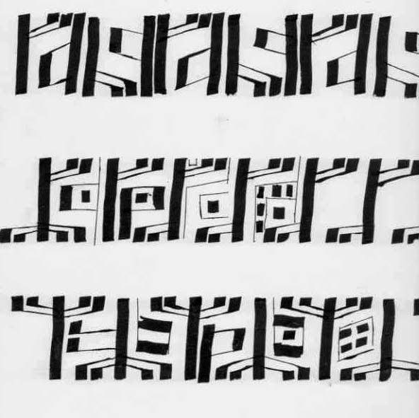
....and then used it to create a border pattern.
But border patterns are not really my thing and as I was thinking about my preferences, I realised that I would prefer to work with some more familiar letters and words. So I started to use words that had some meaning to me even if the were illegible to everyone else. Not that this was particularly illegible, I'm sure that the eagle eyed amongst you can read some of the words below.
Then I varied the shape of the size of the individual letters and this made it more interesting.
So lots of paper filled and the design board in this picture pretty much summarises of the first half of my course.
But in the second part of the course I got freer and started linking the designs to landscapes and I'll show some of these in my next post.
What fun! This is one of my favourite books, bought after your recommendation and having seen your copy.
ReplyDelete