Showing posts with label Designing with Letters. Show all posts

Monday, 2 March 2015

Taking Textiles Further - Inspired by Graffiti

Last weekend I enjoyed another Taking Textiles Further workshop. We only meet 3 times a year but even so, it seemed a particularly long since we last met. This time we were continuing with the theme of text but used graffiti as our inspiration.


This was my first attempt at graffiti and I'm sure that from now on, I'll be paying more attention to graffiti designs when I see any.  In my graffiti, I incorporated elements from my landscape photographs and used some landscape related words I've been 'playing with' recently. I even filled the letters with the textures I created for my flamingo in my lino printing workshop,  so one thing builds on another.

I cut and folded the page of graffiti into a book form to see if any interesting or abstract designs would emerge. 
I've used this folding and cutting technique before and have previously been pleased with the surprise designs that emerged but not so this time. I think this is probably because I don't really like seeing the obviously incomplete words, especially when it's such a large element of the overall design. 

So I did go back to the more traditional method of using two 'Ls' to isolate a few areas for consideration. To some extent this has the same issue but I do like the depth in the 'TES' piece and that this could be an idea worth progressing. 


We also cut out words relating to our theme and randomly over laid them...or as randomly as my brain would let me.

We then isolated areas of the words to draw, hoping some interesting and original designs would emerge. I think the first drawing has potential and I'll give it some thought about how I could develop it. Can you see which areas of the words I drew? No, I thought not.


Graffiti is far removed from my usual style of working but I really enjoyed it. I would like to create some more graffiti designs, probably using colours more akin to colours in the Chilean landscapes and putting a little more fore thought into it, now that I have a better idea of what I would like to achieve. I might even borrow some books on graffiti from the library. On the other hand I should read some of the books I already have in my pile first. I'm very inspired by my current project and am torn between following all the trails my research is leading me down and actually creating something. I guess it's better than having no ideas or leads to follow..... 

Sunday, 7 September 2014

Denise Lach - Designing with Letters - Part 2

I'm just back from a lovely week spent in the south of France and I had every intention of post the 2nd set of pictures from Denise's course before I set off but by the time I had got one piece finished and ready for the framer and another ready for stitching on holiday, I just didn't have the time. 

So here they is some of the work from the 2nd half of the Denise's course and you will see that I started to work in a less controlled way.

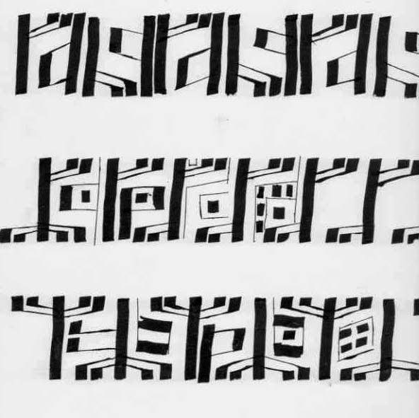
This basic design was built up using a few selected words, with the letters elongated and stretched to make a pattern. I then took photocopies of the design and started to work into and over it by blocking areas out using pens and using ink and tools that were less controllable and dripped ink down the page. 


When I was on holiday these buildings reminded me of these designs, minus the dribbles, obviously. This idea/link might be something worth following up when time permits.  


So going back to the course... I also started exploring how I could use lettering to represent a landscape and started by creating tree trunks and under growth with letters.


I then tried using some coloured ink and a slightly different approach to creating the landscape but still using letters..


...and then a slightly looser style...


You can see from my design board below, that the work I was producing in the 2nd half of the course was much looser and that I have only shown you a fraction of it. My aim was to explore as many ideas and avenues and possible, rather than creating a finished piece of work and I think I did that, I came away with lots of ideas to develop. 


You may know that last year's holiday inspired my Barge in the Mist piece piece and so I was hoping that I would come back with inspiration for my next 'must-make' piece but unfortunately I didn't. I saw some lovely landscapes, architecture and wildlife but when I look back at my photos, it's this one that's giving me food for thought:


This was taken from the train in France and I wanted to see how much blurring I would get when I took the photo from a moving train and whether it would create any interesting images. I didn't get any blurring at all and I guess that's down to the wonders of technology but I did like the way my red top and yellow fabric reflected in the window and created a colourful and interesting landscape.  Something else to think about because a lot of landscapes can be very green, certainly in this country and this could be one way adding some additional colour interest.

And when I returned home this is what I found on my doorstep....


...what a lovely surprise! I had won Gina's giveaway and as ever, Gina had presented the buttons beautifully. I'm not sure how I'm going to use them yet but in the meantime, I'll just enjoy looking at them as they are.


Tuesday, 26 August 2014

Denise Lach - Designing with Letters - part 1

I recently spent a very enjoyable and inspiring 4 days on a Denise Lach course. Not a calligraphy course but more a course learning about designing with letters. I bought this book about three years ago and I have been hoping to go on one of Denise's courses ever since. I can thoroughly recommend the book. 


The course was based on 'foreign' scripts and as the idea was to use the letter shapes to design, it didn't matter at all that you couldn't read it or understand what you had written. I chose Runes as my script and this was one of my first attempts at using it. 


I also wrote the script a lot smaller and I preferred this....


....and then I mixed the two sizes...well I did enough to get the idea of what it would look like and I liked the variation this provided.


Then I took just one of the letters and the added a little variation to it.


....and then used it to create a border pattern.

But border patterns are not really my thing and as I was thinking about my preferences, I realised that I would prefer to work with some more familiar letters and words. So I started to use words that had some meaning to me even if the were illegible to everyone else. Not that this was particularly illegible, I'm sure that the eagle eyed amongst you can read some of the words below.


Then I varied the shape of the size of the individual letters and this made it more interesting.
So lots of paper filled and the design board in this picture pretty much summarises of the first half of my course.


But in the second part of the course I got freer and started linking the designs to landscapes and I'll show some of these in my next post.